Pulse Insider
A visual system for Pulse Canada’s new email newsletter that extends their existing brand into a consistent, recognizable template.
Working within established branding, we created a newsletter-specific logo concept, supporting graphic elements, and flexible content modules that make each issue easy to scan and simple to assemble.
Because the newsletter drives readers back to the website for full articles and promotions, we also designed a dedicated section on the site to house these articles—aligned with the existing brand and website design—so the email and web experience feel cohesive from inbox to landing page.
Logo evolution for email
Starting from the existing logo geometry, we developed a clear, scalable mark tailored to newsletter use.
Source shape
An existing logo element became the starting point.
Concept refinement
Flipping the orientation created a speech bubble.
Adding text lines solidified meaning.
Colour exploration
Options stayed strictly within the brand palette for consistency.
Scale testing
A micro mark ensured readability at small sizes.
Reusable design toolkit
Supporting graphic elements and flexible content modules scale across different issue types.
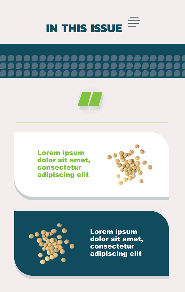
Photo treatments
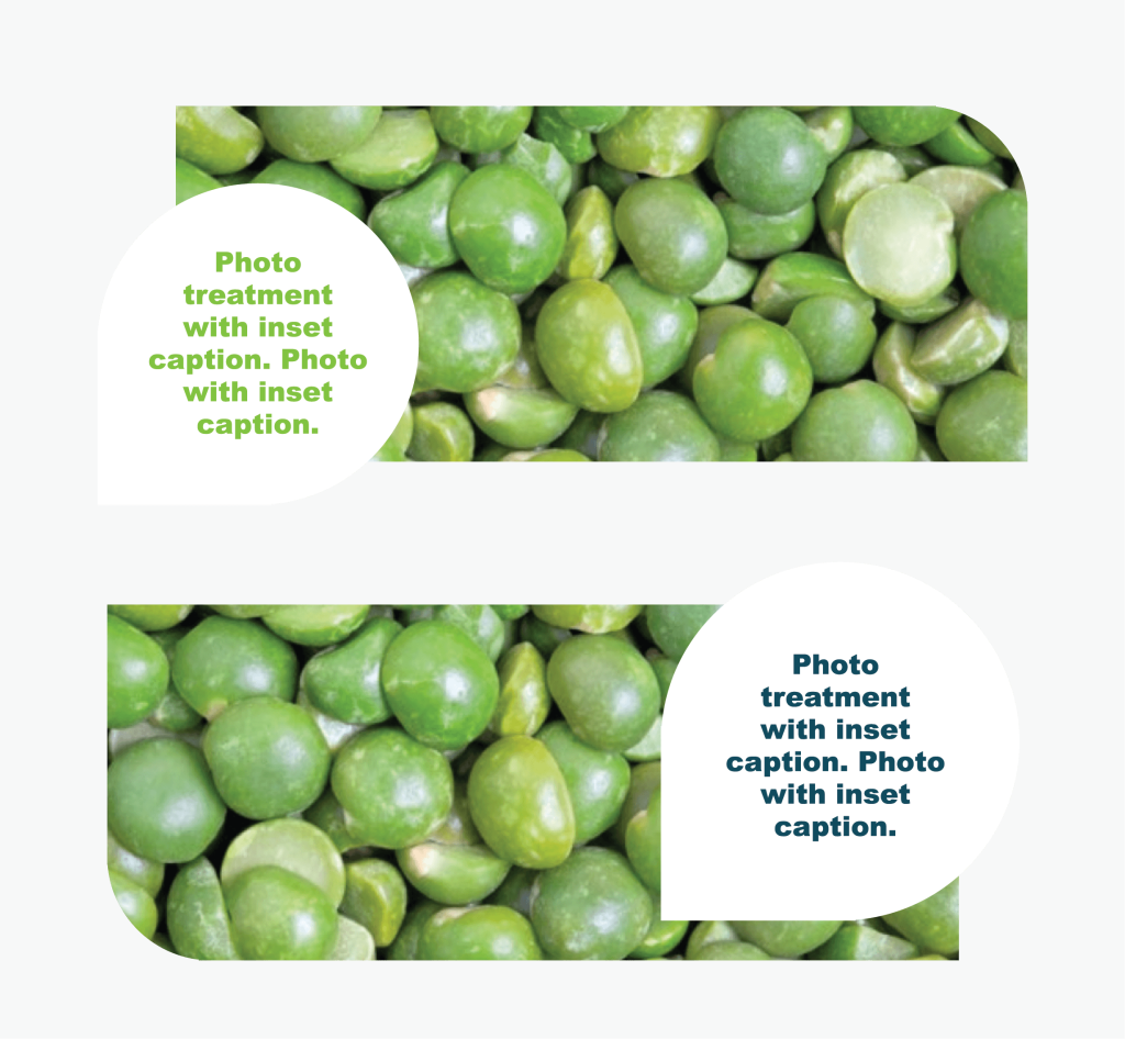
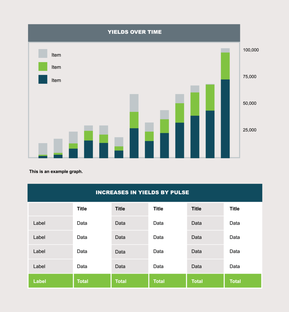
Chart and graph treatments
Our Work
-
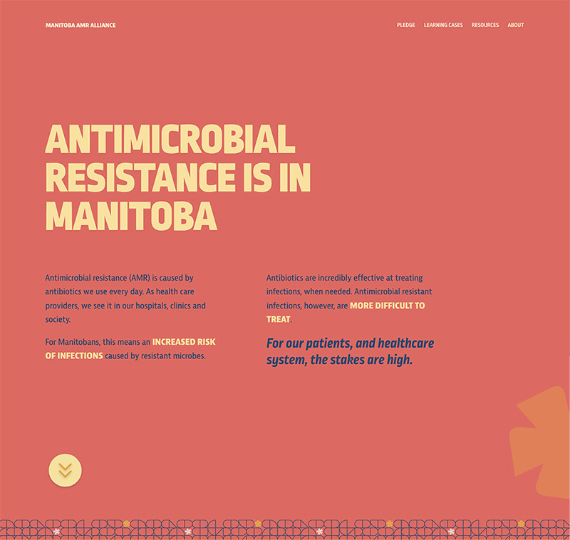
Manitoba AMR Alliance
Manitoba AMR Alliance The Manitoba AMR Alliance is a growing initiative to slow the emergence and spread of antimicrobial resistance (AMR). The initiative centres on a personal, pledge-based appeal to prescribe responsibly, directed to Manitoba prescribers and healthcare professionals. Our challenge was to create an engaging and easy pledge form for health professionals. Attention grabbing design…
-

My cool project
My content. My content. My content. My content. My content. My content. My content. My content. My content. My content. My content. My content. My content.